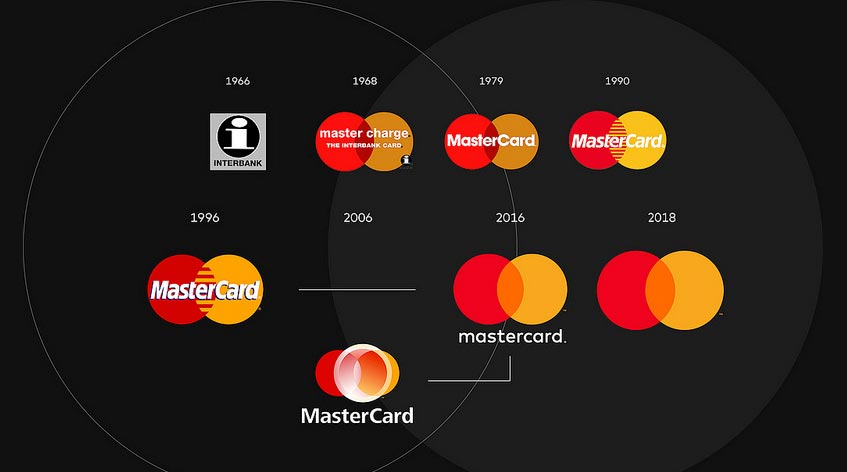
On January 7, as part of CES 2019 in Las Vegas, MasterCard announced that the company name will no longer appear within its logo. The American multinational, which currently operates the fastest payment processing network in the world, connecting consumers, financial institutions, businesses, governments and businesses in over 210 countries, has decided to carry out a logo restyling operation.
The restyling is mainly due to the evolution of the payments world, which day by day is moving more and more towards the digital world. Raja Rajamannar, Head of Marketing and Communications at MasterCard, told USA Today: ” Reinvention in the digital age requires modern simplicity .”
So off the company name from the Logo, as already done by Apple and Nike. There remain the two red and yellow circles, which intersect each other, symbolizing MasterCard’s promise to connect and connect people to the “priceless” possibilities offered by the company.

“The decision to remove the name from the logo, however, is not accidental. The basic idea of MasterCard – as we read on Forbes – however, is not so much to emulate other successful companies, but to establish itself as a technology company. In fact, over the last few years, an increasing number of consumers are starting to pay without contact or directly through their smartphone or laptop.
In addition to this, as can be seen from the press release that anticipated the change of logo, MasterCard no longer intends to be considered as a “simple” payment processing company and more generally financial services. On the contrary, it wants to be recognized as a completely digitized company. ”
A Connected Consumer research by MastercCard, conducted by GFK Eurisko , highlights the changed approach of Italian and continental consumers towards digital payments. There is a clear propensity to use the smartphone for purchases: almost half (47%) prefer the smartphone as a tool for their daily purchases. A figure that exceeds that of European citizens (33%).


